The University of Windsor approved fonts for print materials are DIN and Amasis.
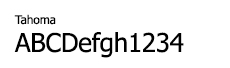
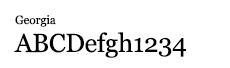
Secondary fonts for limited uses include DIN Condensed (advertising materials), Tahoma, and Georgia (web).
Primary typeface: DIN
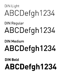
DIN is a realist sans-serif typeface that was widely used for traffic, administrative and technical applications. It was defined by the German standards body DIN - Deutsches Institut für Normung (German Institute for Standardization) in the standard sheet DIN 1451-Schriften (typefaces) in 1931.
The popularity of the typeface grew beyond this original context because it (unintentionally) embodied many of the ideological principles in play in Europe at the time – Realism and Modernism in particular – which attempted to scrape away as much of the cultural references and adornments in as many things as possible.
Now DIN is being used all over the world in a wide variety of contexts. It is celebrated for being clean, modern, bold, and striking–it looks contemporary and feels strong. It is straight-forward and “tells the truth.” Its impersonal and neutral character allows it to be a typographic backbone, letting everything else in the design and layout do the talking.
Primary typeface: Amasis
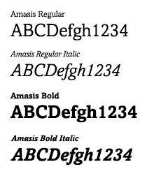
Amasis is a slab serif design which has been drawn with a humanist approach, rather than the traditional geometric construction associated with this style of letter. The result is a typeface that has an affinity with classical design, although in character it belongs to the latter decades of the twentieth century. The Amasis italic fonts, rather than being sloped roman or cursive in nature, are related more to the Old Style italics. Amasis works particularly well in small sizes where readability is important.
Secondary Typefaces: